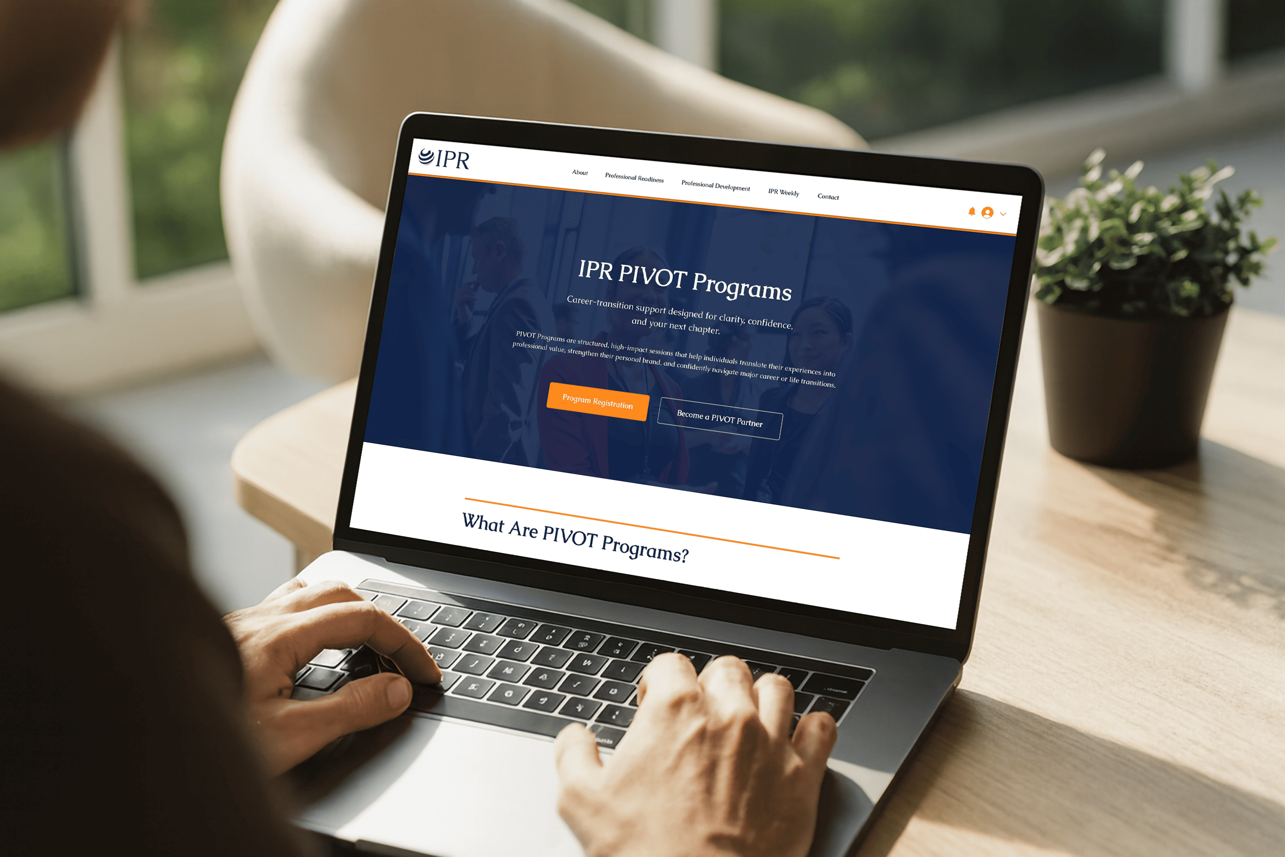
IPR Platform
Product & Platform Systems Design
IPR is a professional development platform serving individuals, organizations, and partners through a mix of one-time programs, recurring memberships, and gated executive resources.
My Role
End-to-end design ownership: UX, UI, information architecture, membership logic, and implementation support.
Scope
UX/UI design, information architecture, membership access logic, CMS, booking automation, visual system.
System at a Glance
Multi-Audience Architecture
Visitors, members, partners, admins
Membership & Access Logic
Time-based unlocking tied to tier
Admin & CMS Control
Content scheduling and configuration
Booking & Automation
Self-serve with backend workflows
Four interconnected systems designed to work as one.
The Problem
Before this work, IPR's offerings were difficult to understand and difficult to manage.
From a user perspective
- Programs and memberships overlapped without clear differentiation
- Access rules were unclear and manually enforced
- The experience felt fragmented rather than cohesive
From an operational perspective
- Content access was handled manually
- Booking and scheduling required unnecessary intervention
- There was no unified system tying together programs, memberships, and resources
The challenge was not aesthetic.
It was structural.
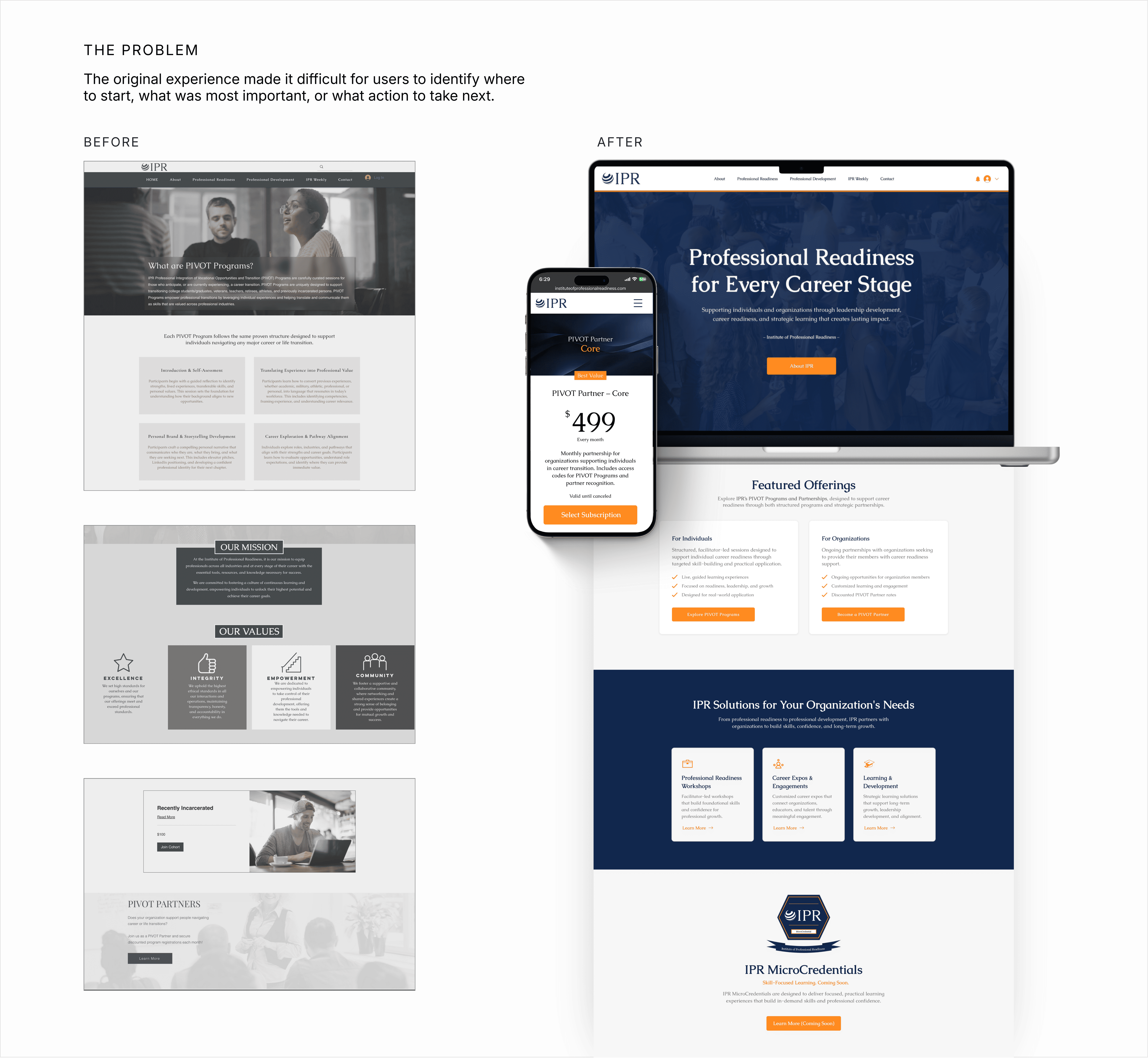
Rebuilt as a governed platform, not a marketing site
IPR adapts content visibility and calls to action by user role and membership state, making access rules legible to users and operationally manageable for admins.
Governed access states
A single content system with role and tier rules controlling visibility and actions.
State-driven CTAs
One CTA component changes label and behavior based on access state, avoiding duplicated UI.
Admin autonomy
Admin tools support scheduling, configuration, and updates without designer involvement.
Design Goals
Five principles shaped every decision.
Reduce cognitive load across offerings and access states
Make access rules feel invisible, not enforced
Establish an executive-level visual tone without feeling cold
Design for scale so the platform could grow without breaking
Support autonomy through a maintainable CMS
Shared resources, programs, assets
Role-based visibility rules
Booking, downloads, interactions
Shared resources, programs, assets
Role-based visibility rules
Booking, downloads, interactions
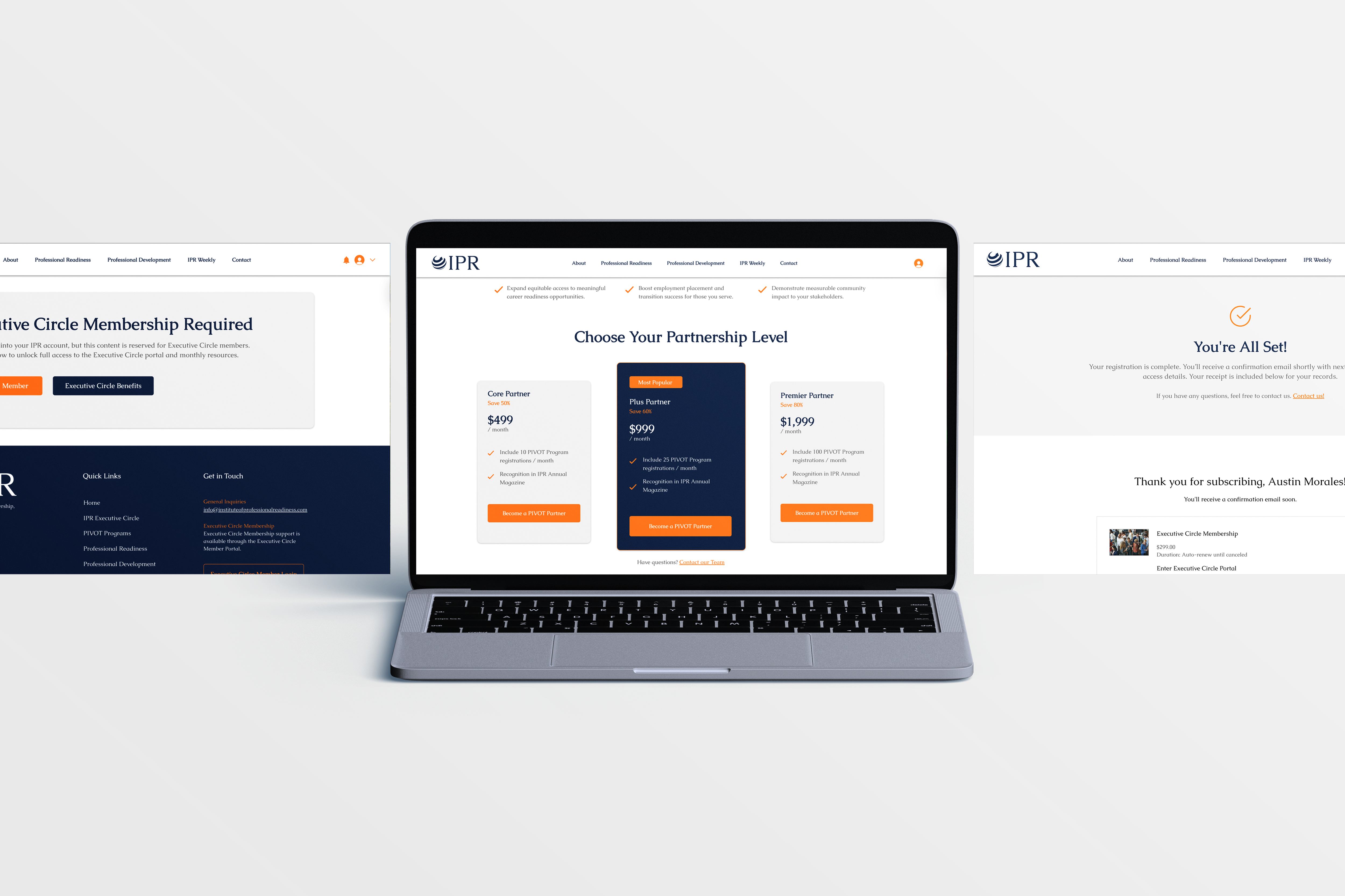
Member portal designed to make complex access rules feel invisible.
Access & Membership Logic
Access is state-driven, not page-driven. Users move through the same system with different permissions. The interface adapts based on role and membership status.
Access State Matrix
One interface supports multiple roles. Access rules control visibility and actions, reducing cognitive load for users and maintenance complexity for administrators.
CTA State Transformation
A single component adapts its behavior and labeling based on user state. No duplicate UI is created.
Same component. Different context. Zero duplication.
Identical components persist across audiences. Only state and permission change.
Admin CMS
Operational Capabilities
Managed by team, no code required
Configurable per role and tier
Automated release and visibility
Designed for long-term autonomy, not designer dependence.
UX Flows & Key Moments
Critical interactions were designed to communicate system state without friction.
Locked vs Unlocked States
Goal Action Plan Template
WorksheetA practical goal-setting and accountability tool that helps leaders translate priorities into action.
This resource was released before your membership started, so it isn't available in your library.
Content visible. Interaction disabled. Join date determines access timing.
Goal Action Plan Template
WorksheetA practical goal-setting and accountability tool that helps leaders translate priorities into action.
Full access. Immediate interaction. Content is simply present.
Goal Action Plan Template
WorksheetA practical goal-setting and accountability tool that helps leaders translate priorities into action.
Not quite yet. This unlocks on January 31, 2026.
Content visible. Interaction disabled. Release date determines access timing.
Identical components, different access behavior.
Operational Flows
Member Action Feedback
Clear feedback without interruption. No modals, no page changes.
Admin-to-User Propagation
Preview visible
Full content available
Content + materials
One action propagates to all views. No manual sync required.
Booking and Automation
Member selects session
Availability reflects access tier and release timing
System validates state
Access, eligibility, and capacity checked automatically
Booking confirmed
User receives confirmation without leaving the page
Admin automation triggered
Capacity updates, scheduling rules applied, no manual intervention
One action. State-aware validation. Fully automated follow-through.
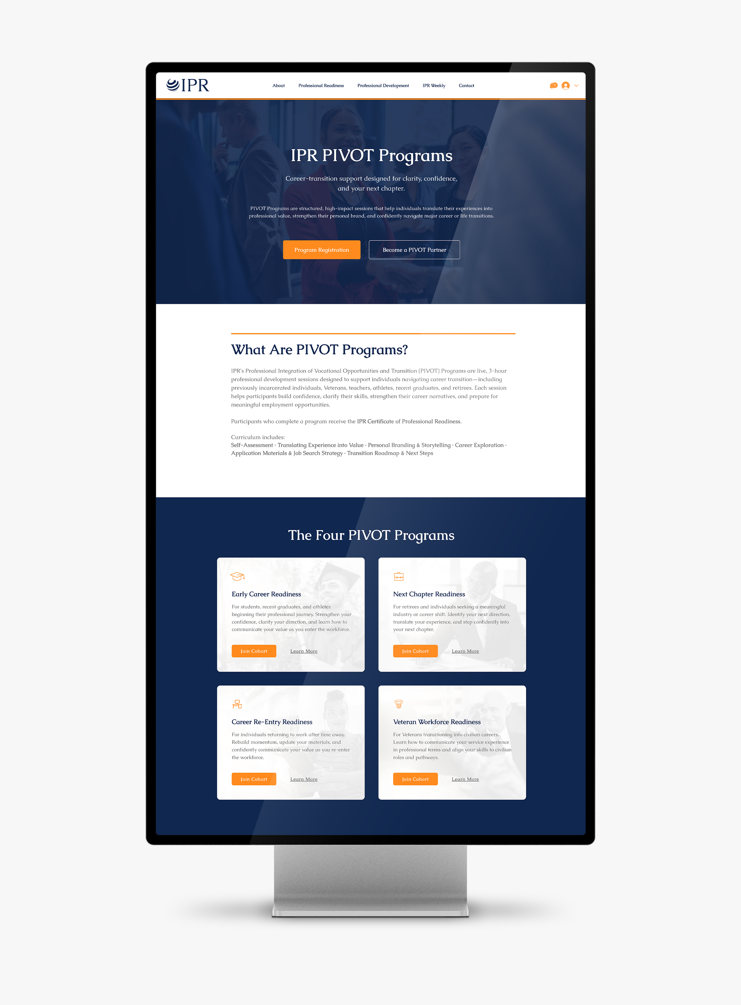
PIVOT Programs page with cohort registration and partner booking flows.
Visual Language
Visual decisions prioritize clarity over decoration. Color communicates state, typography establishes hierarchy, and spacing creates rhythm that supports scanning and deeper reading.
Color signals availability. Inactive states remain visible but muted.
Emphasis communicates priority without changing layout.
Hierarchy guides reading without visual noise.
Outcomes and Impact
Design decisions focused on clarity, predictability, and autonomy led to measurable improvements in usability, scalability, and long term maintainability.
Clarity and Confidence
- Users could immediately understand what content was available and why
- Locked content remained visible, reducing confusion and hesitation
- Interaction states eliminated trial and error behavior
Operational Autonomy
- Admin users could schedule, configure, and manage content independently
- Reduced reliance on designers for routine updates
- System changes did not require UI rework
Long Term Stability
- Visual restraint supported ongoing usability
- Predictable patterns reduced onboarding friction
- The platform scaled without redesign pressure