Research Report Redesign
Making academic research more accessible through UX/UI and information design.
A self-initiated design case study transforming a dense academic thesis into a modern digital research report with improved hierarchy, navigation, data visualization, and readability.
Role
UX/UI Designer, Visual Designer, Content Designer
Project Type
Self-Initiated Redesign
Category
Platform — Data Visualization
Focus
Information Design, Editorial UX, Data Visualization, Research Communication
Output
Responsive Digital Research Report
Why This Project Exists
I revisited my original sociology research and redesigned it as a modern digital research report. The goal was to preserve the original research while improving how the information is structured, read, navigated, and understood.
The original document contained real research, survey data, literature review themes, methodology, findings, limitations, and a conclusion. However, the traditional academic paper format made the content harder to scan, compare, and understand quickly. This redesign is a self-initiated exploration of how UX/UI and information design can make dense research more accessible without changing the original meaning.
Institution
Virginia Commonwealth University
Course
Sociology Senior Seminar
Term
Spring 2019
Sample
Survey of 63 college students
Topic
Facebook, Twitter, political ideology, trust, and media bias
How might I preserve the credibility and content of the original academic research while making it easier to navigate, scan, understand, and present visually?
- 01
Key findings were buried inside long-form body copy
- 02
Charts and tables felt default and academic
- 03
The document lacked a modern visual hierarchy
- 04
Dense sections made scanning difficult
- 05
The research needed clearer storytelling for a broader audience
Before: Traditional Academic Paper
The original paper was academically valid, but the format was not optimized for digital reading or portfolio presentation. These frames show the original document, captured from the source PDF.
Original thesis cover page before redesign
Original abstract and introduction page before redesign
Original demographic tables from the thesis results section
Original survey charts before redesign
Dense paragraphs
Limited visual hierarchy
Basic table formatting
Default chart styling
Findings require close reading
No navigation support
Design Strategy
Clarify the research story
Pull the most important findings forward so readers understand the report faster.
Improve information hierarchy
Use stronger section structure, summaries, cards, pull quotes, and progressive disclosure.
Redesign the data experience
Translate default charts and tables into cleaner, more readable visualizations.
Preserve research integrity
Improve presentation without inventing new findings or changing the original study.
What Changed
Side-by-side comparisons showing how each part of the static academic PDF became a designed digital research experience.
Original abstract and introduction page before redesign
Redesigned executive summary section from the digital research report
Original demographic tables from the thesis results section
Redesigned participant snapshot section with demographic visual summaries
Original survey charts before redesign
Redesigned trust and concern charts from the research report
Original survey charts before redesign
Redesigned written response themes section from the research report
Key Design Decisions
Reframed the research as a digital research report
The redesign keeps the original 2019 research context but changes the reading experience from a static paper to a structured digital publication.
Surfaced key findings earlier
The most important insights are pulled into a dedicated findings section so readers do not have to search through dense paragraphs.
Created a custom data visualization system
Charts were redesigned with direct labels, clearer comparisons, stat cards, and explanatory captions.
Added navigation and scanability
Sticky navigation, section anchors, strong headings, and modular sections help readers move through the report more easily.
Balanced polish with credibility
The visual system is modern and portfolio-ready, but restrained enough to preserve the seriousness of the research.
The Redesigned Research Experience
Screenshots captured from the live redesigned report. Each frame documents exactly which section to capture from the live site.
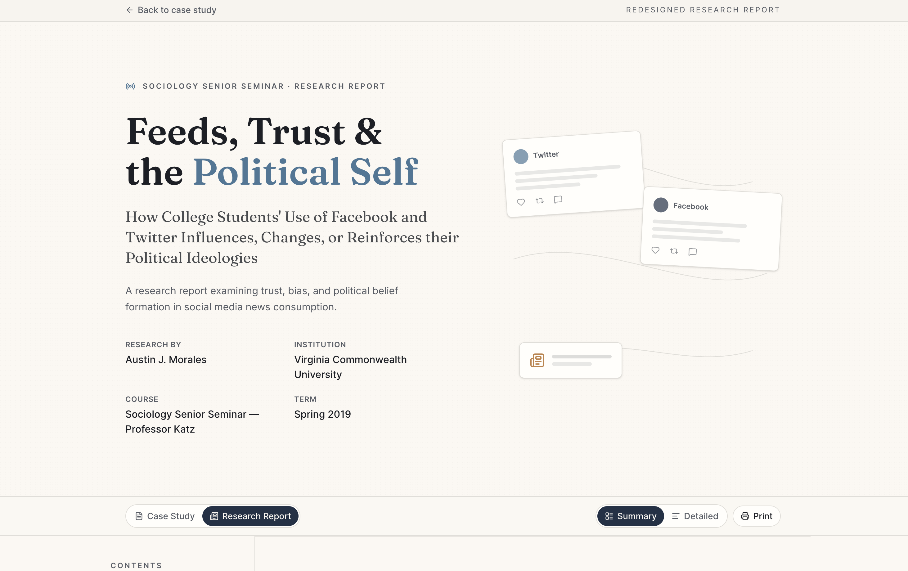
Redesigned research report hero section
Executive summary built for scanning: Reframes the academic abstract into a scannable overview.
Redesigned executive summary section from the digital research report
Key findings surfaced earlier: Pulls the most important research takeaways forward.
Redesigned key findings cards from the research report
Methodology translated into process cards: Converts study details into digestible process cards.
Redesigned methodology section with process cards
Demographics redesigned as visual summaries: Turns demographic tables into cleaner visual summaries.
Redesigned participant snapshot section with demographic visual summaries
Platform comparison made easier to read: Makes Facebook vs Twitter findings easier to compare.
Redesigned platform comparison section comparing Facebook and Twitter findings
Trust and concern data redesigned for comprehension: Redesigns survey trust and concern data for faster comprehension.
Redesigned trust and concern charts from the research report
Written responses organized into themes: Organizes qualitative insights into theme cards.
Redesigned written response themes section from the research report
Outcome
The final redesign transforms a dense academic paper into a polished digital research experience. The project demonstrates how information design can improve readability, hierarchy, navigation, and data comprehension while preserving the original research.
Improved scanability
Clearer research narrative
Stronger visual hierarchy
More readable data presentation
Portfolio-ready design artifact
Better connection between research, content, and UX design
Reflection
Revisiting this research helped connect my background in sociology and research with my current design practice. The project became an exercise in making complex information easier to understand, without changing the meaning of the original work.
View the Full Research Report
The full redesigned report is available as a separate live prototype.
Redesigned key findings cards from the research report