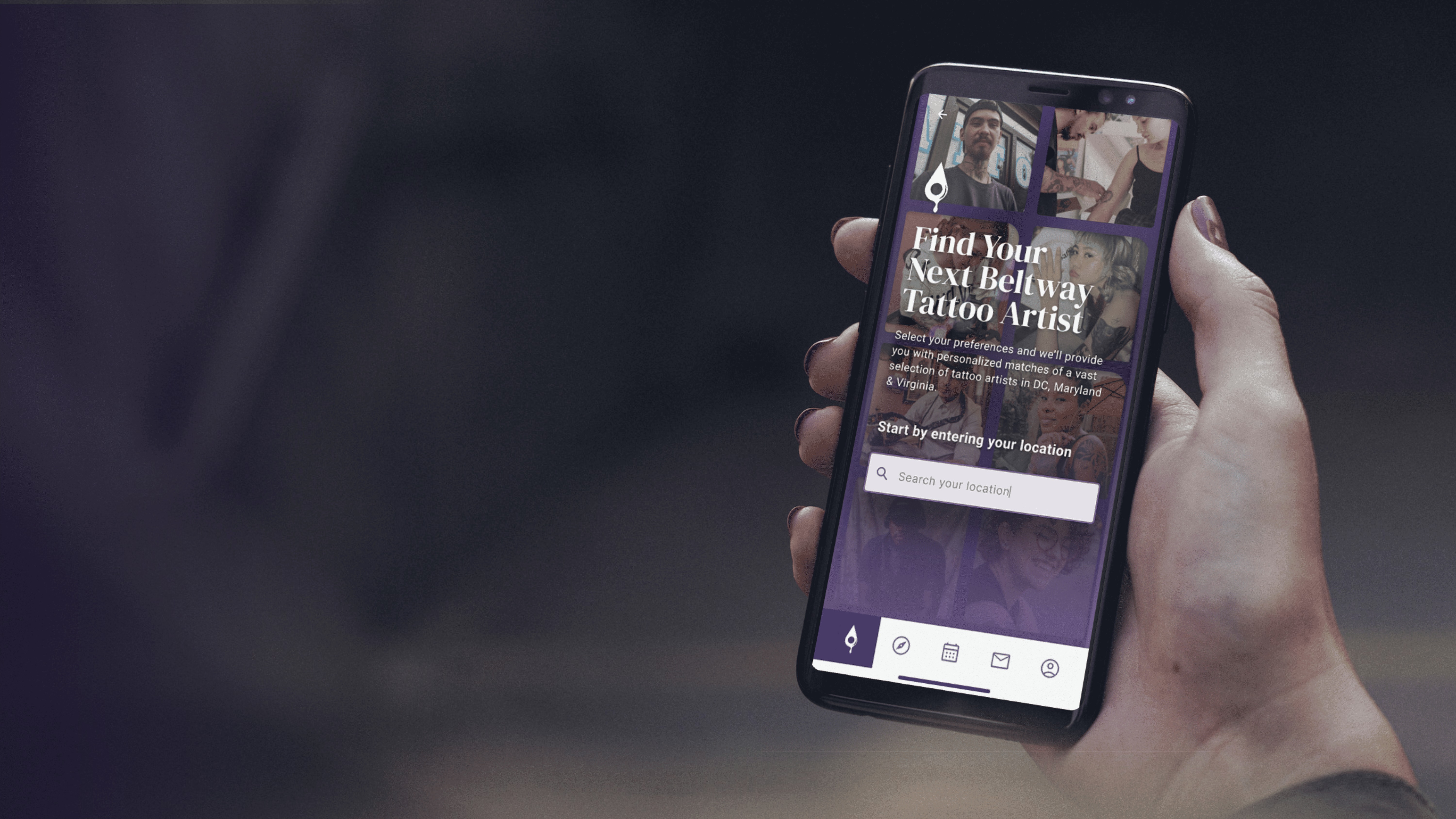
Beltway Ink
A mobile platform for discovering and booking tattoo artists across the DMV.
Research-driven mobile app that transforms how young adults find, evaluate, and book tattoo artists. From zero to prototype through user research, testing, and iterative design.
Role
UX/UI Design, Research, Prototyping
Timeline
General Assembly, 2023
Platform
iOS Mobile App
The system is broken,
not the users.
Tattoo websites are insufficient
Broken layouts, poor photography, and missing information about specialties or availability.
Instagram as a workaround
Users default to social media because it has more information. It was never designed for this.
No transparency in booking
Pricing, deposits, and availability are rarely clear upfront. Users navigate blind.
I want a tattoo.
Now what?
How might we improve the process of finding and booking a tattoo artist for young adults around the DMV?
of Americans 18-29 have at least one tattoo.
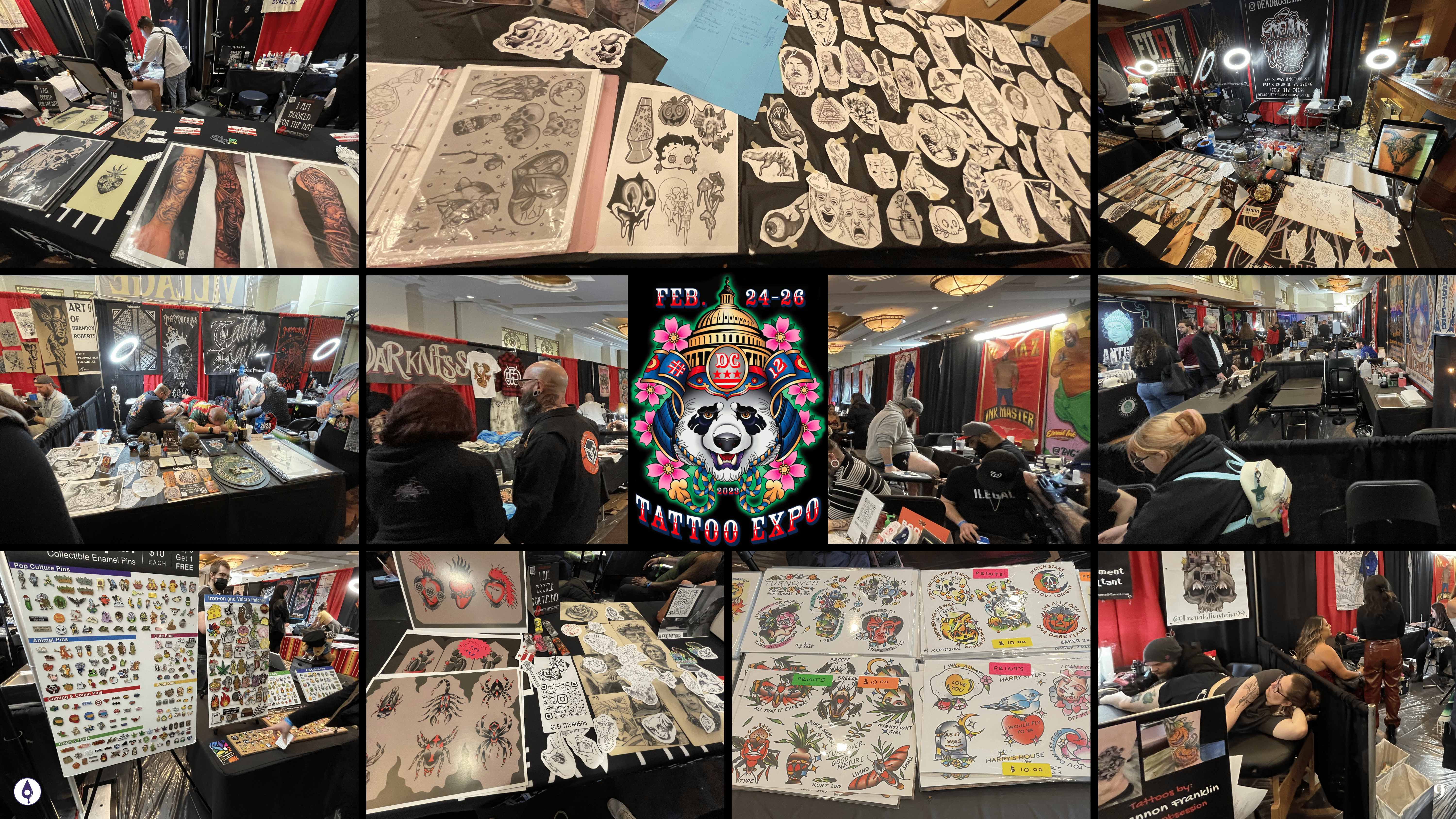
7 interviews. 3 audiences. 1 expo.
“I don't think any part of the process is easy.”
Discovery is tedious and time-consuming
“It's easier to find artists and their work on Instagram.”
All roads lead back to Instagram
“Tattoo websites are clunky and not very user friendly.”
Existing platforms fail on basics
Finding a tattoo artist
is not a transaction.
It is a permanent decision that demands trust, context, and alignment.
Matching over browsing.
Clarity over noise.
Discovery and booking. Everything else is secondary.
Structure before polish.
User flow architecture ↗
Mid-fidelity wireframes ↗
Didn't know where to start matching.
Clearer onboarding
Confused by News tab and feed placement.
Simplified nav
Collections vs. saved posts unclear.
Renamed to My Ink
Research defined the problem. Strategy shaped the response.
The app experience.
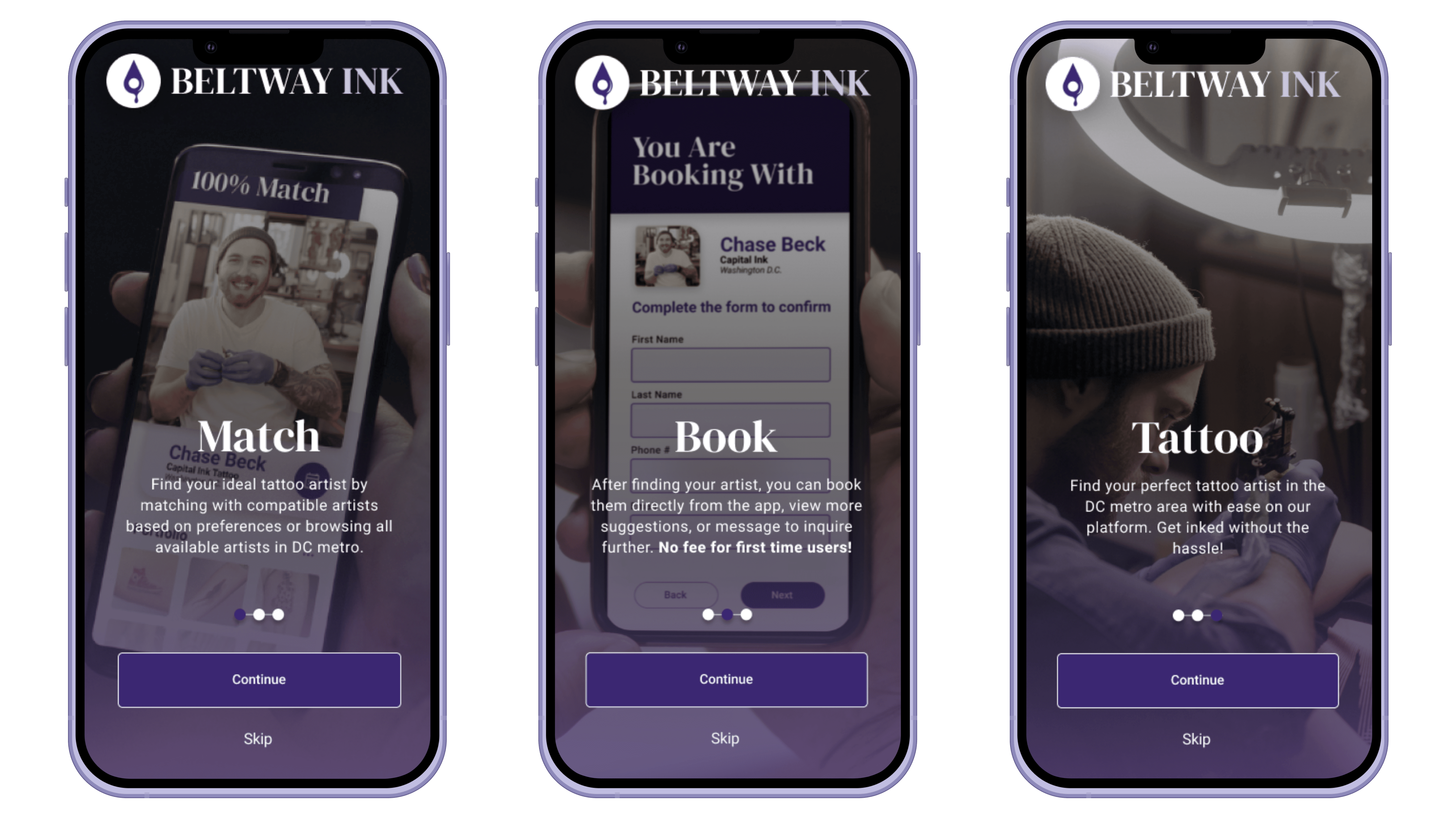
Match
Answer a few questions. Get artists who fit -- not endless feeds.
Book
See availability, pricing, and next steps before committing.
Communicate
Message artists in context, with references and expectations aligned.
Explore
Browse nearby artists, studios, and styles without losing clarity.
Why purple?
Creativity, trust, and individuality. Confident and a little rebellious.
What I learned.
Restraint is the hardest design decision.
Early iterations had social features, community feeds, and user profiles. Testing made it clear: solve discovery and booking first. Everything else is noise until the core works.
Permanent outcomes demand earned trust.
When the decision is irreversible, every step needs to build confidence. Reviews, credentials, transparent pricing, and cultural literacy all compound toward that.
The future is bright and covered in ink.
For those who want the receipts.
Research artifacts, early explorations, and process documentation.