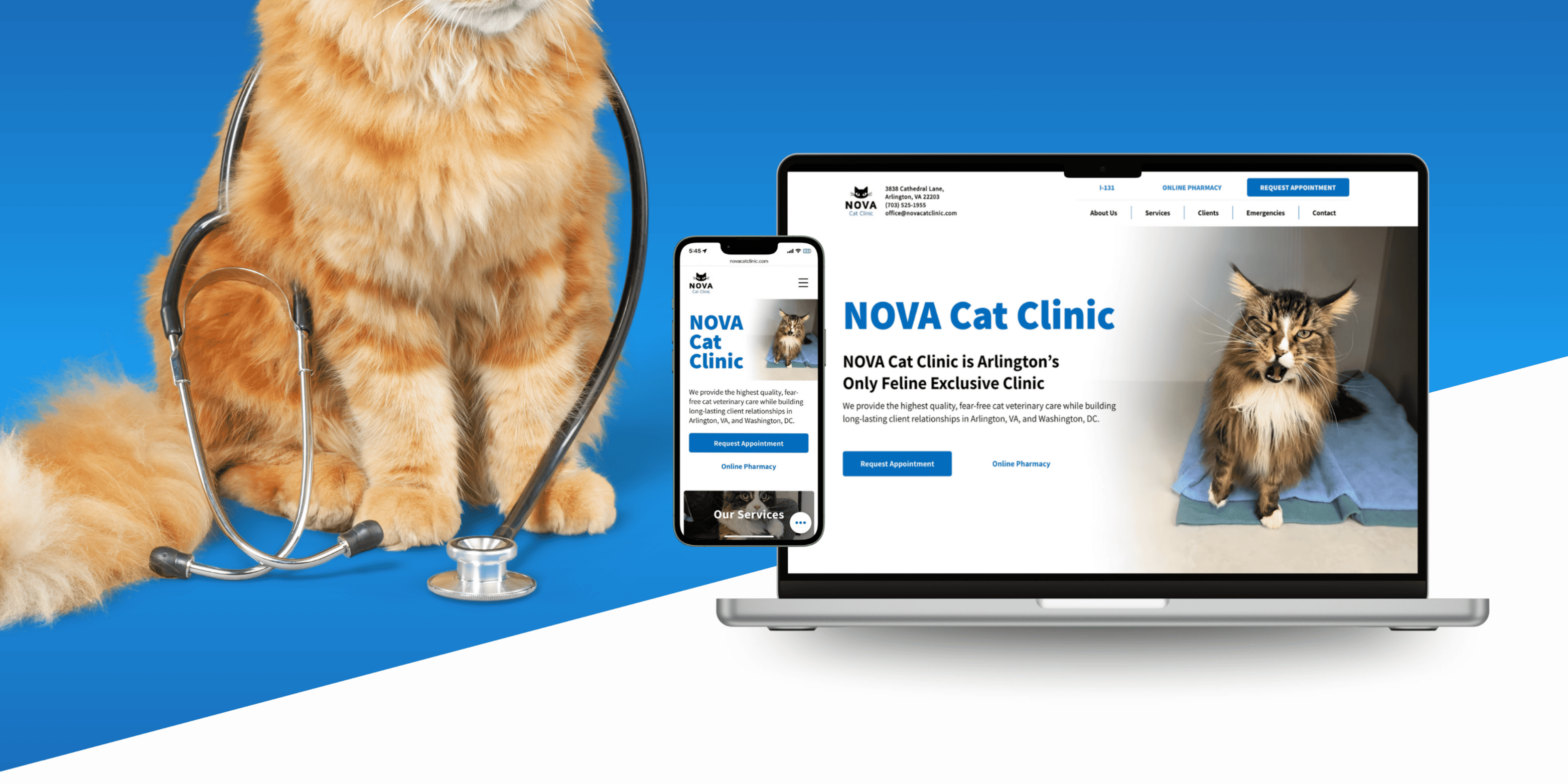
Nova Cat Clinic
A digital experience designed to reduce anxiety, establish medical trust, and support critical decision-making when it matters most.
A complete redesign for Arlington's only feline-exclusive veterinary practice, focused on clarity, trust, and reducing anxiety at critical moments.
Role
UX/UI Design, Visual Design, SEO Strategy
Scope
Full website redesign, custom graphics, content strategy
Industry
Veterinary Healthcare
When clarity is missing, stress compounds.
The original site created friction
during moments of stress.
When users needed reassurance and clarity, the site added uncertainty.
Cat owners reach for their vet's website in moments of worry. The existing site buried critical information, offered no mobile experience, and was invisible to search.
Buried information
Emergency contacts, hours, and services required multiple clicks to reach.
No mobile experience
60%+ of visitors were on mobile. The site was not responsive.
Zero search visibility
No SEO structure. Invisible to local search despite strong word-of-mouth.
The original site, before redesign
Designing for emotional state, not demographics.
Healthcare decisions are emotional before they are informational.
Users arrive with urgency, concern, and limited patience.
Clarity and reassurance matter more than visual novelty.
How do you communicate medical credibility
without overwhelming users who are already anxious?
Reduce cognitive load.
Trust follows clarity, not persuasion.
Every design decision prioritized comprehension under stress. The goal was not to persuade, but to remove uncertainty.
Hierarchy over decoration
Lead with the most urgent information. Let visual structure do the work.
Consistency as credibility
Predictable patterns and restrained palette build subconscious trust.
Mobile-first, anxiety-aware
Large tap targets, clear CTAs, critical info above the fold.
SEO as a design decision
Heading hierarchy and page architecture built for search and for users.
Letting the design speak.
After: responsive design system across all devices
Representative screens across key patient and caregiver flows.
Simplified navigation
12 items to 6. Emergency info on every page.
Mobile-first layouts
Built for 60%+ mobile audience. Critical info above the fold.
Clear calls to action
Appointment and pharmacy elevated sitewide.
SEO-driven structure
Semantic HTML drove 59% organic search traffic.
Sustained performance over time.
These results reflect sustained performance, not launch traffic, indicating long-term usability, search visibility, and user trust.
Nearly six in ten visitors arrive through organic search. Evidence that heading hierarchy, semantic structure, and keyword-aligned content are functioning as intended.
Mobile sessions mirror search traffic almost exactly. Designing for one-handed, high-stress use was the right call, and the numbers reflect it month over month.
129 appointment and contact form submissions confirm that reduced friction translates to real engagement. The site performs reliably not because of a launch spike, but because the underlying design decisions hold.
What this project reinforced.
Healthcare UX is not marketing.
Users arrive with real concerns. Every decision must reduce friction, not persuade.
Trust is built in the details.
No single element creates trust. The system does. Consistency, predictability, and transparency compound into credibility.
Good healthcare design is invisible.
It simply works when it matters most.
This project reinforced how clarity, empathy, and restraint scale across systems.